Dvo – company profile and international positioning
A shift in tone
When a company decides to renew its language, it is not simply about updating a graphic sign. It means redefining how it presents itself to the market.
DVO was in a phase of strategic evolution, with the objective of strengthening its international positioning and making its communication more contemporary, solid, and recognizable.
The rebranding required a coherent translation across all tools.
Translating rebranding into structure
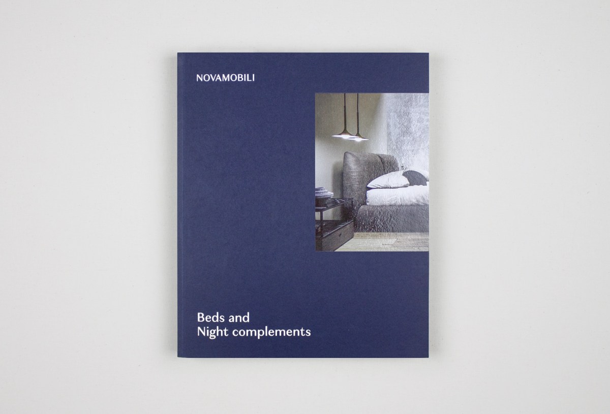
Our intervention focused on building an editorial system capable of supporting the brand’s new language. We worked on defining the color system – blue as the identity tone –, the photographic style, and the visual hierarchy.
It was not about choosing colors or images. It was about building a structure capable of lasting over time.
Building a coherent narrative
The company profile became the central tool of this transition.
We developed a non-conventional narrative approach inspired by the concept of continuous flow: an editorial construction guiding the reader through identity, vision, and product system without rigid fragmentation.
A narrative that does not merely describe, but builds perception.
Hierarchy and readability
Typography, image rhythm, alternation between solids and voids, calibrated use of color: every element was designed to ensure clarity and accessibility.
The visual structure organizes content, guides attention, and supports the message. It is not decoration, but structure.
A tool for internationalization
The result is a corporate tool capable of representing the company across different contexts, maintaining coherence and solidity.
The company profile becomes a strategic device: not just presentation, but positioning support.
Client
DVO
Year
2022
Activities
Communication, Graphic Design
Concept
Grucciadesign.
Photos
Studio Emozioni

“Our intervention focused on building an editorial system capable of supporting the brand’s new language.”
“Our intervention focused on building an editorial system capable of supporting the brand’s new language.”


“We worked on defining the color system – blue as the identity tone –, the photographic style, and the visual hierarchy.”
“We worked on defining the color system – blue as the identity tone –, the photographic style, and the visual hierarchy.”

“The visual structure organizes content, guides attention, and supports the message. It is not decoration, but structure.”
“The visual structure organizes content, guides attention, and supports the message. It is not decoration, but structure.”

“The company profile becomes a strategic device: not just presentation, but positioning support.”
“The company profile becomes a strategic device: not just presentation, but positioning support.”