Case History – Maquis A.R.T.
The brand identity design for MAQUIS A.R.T. was a careful and detailed process, starting with the information provided by the client to define a unique and distinctive approach that reflected the company’s personality and mission.
MAQUIS A.R.T. offers tailor-made services in the fields of architecture and real estate, and this aspect had to be reflected in the brand identity through a bespoke, unique, and distinctive design that evoked attention to detail and personalization. The company supports clients from the early stages of the process, providing assistance during the selection and development of the project, and this had to be evident in the coordinated image and the presentation of materials, creating a sense of trust and support.
The goal of MAQUIS A.R.T. is to transfer art into people’s way of living, and this concept was the core of the brand identity, inspiring the design, colors, and communication tone of the company.ivo dell’azienda.
The main goal of designing the language for MAQUIS A.R.T. was to create a visual identity perfectly aligned with the company’s philosophy and needs, exploring and reflecting the fundamental values that define it. The developed visual language is contemporary, immediate, consistent, current, distinctive, and recognizable, and will be the means through which MAQUIS A.R.T. can effectively communicate with its audience.
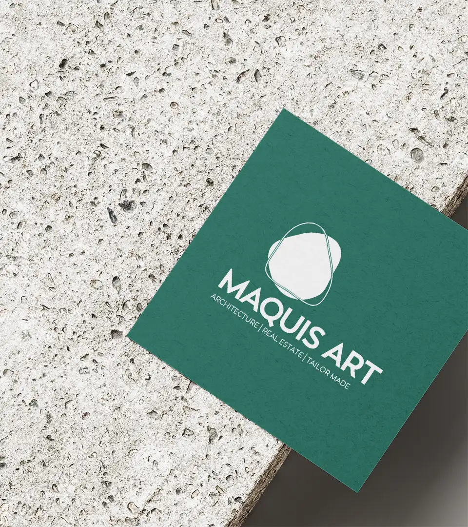
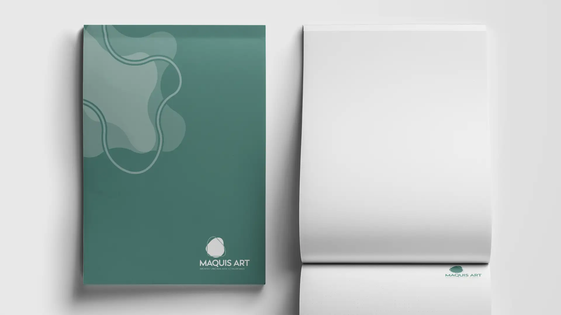
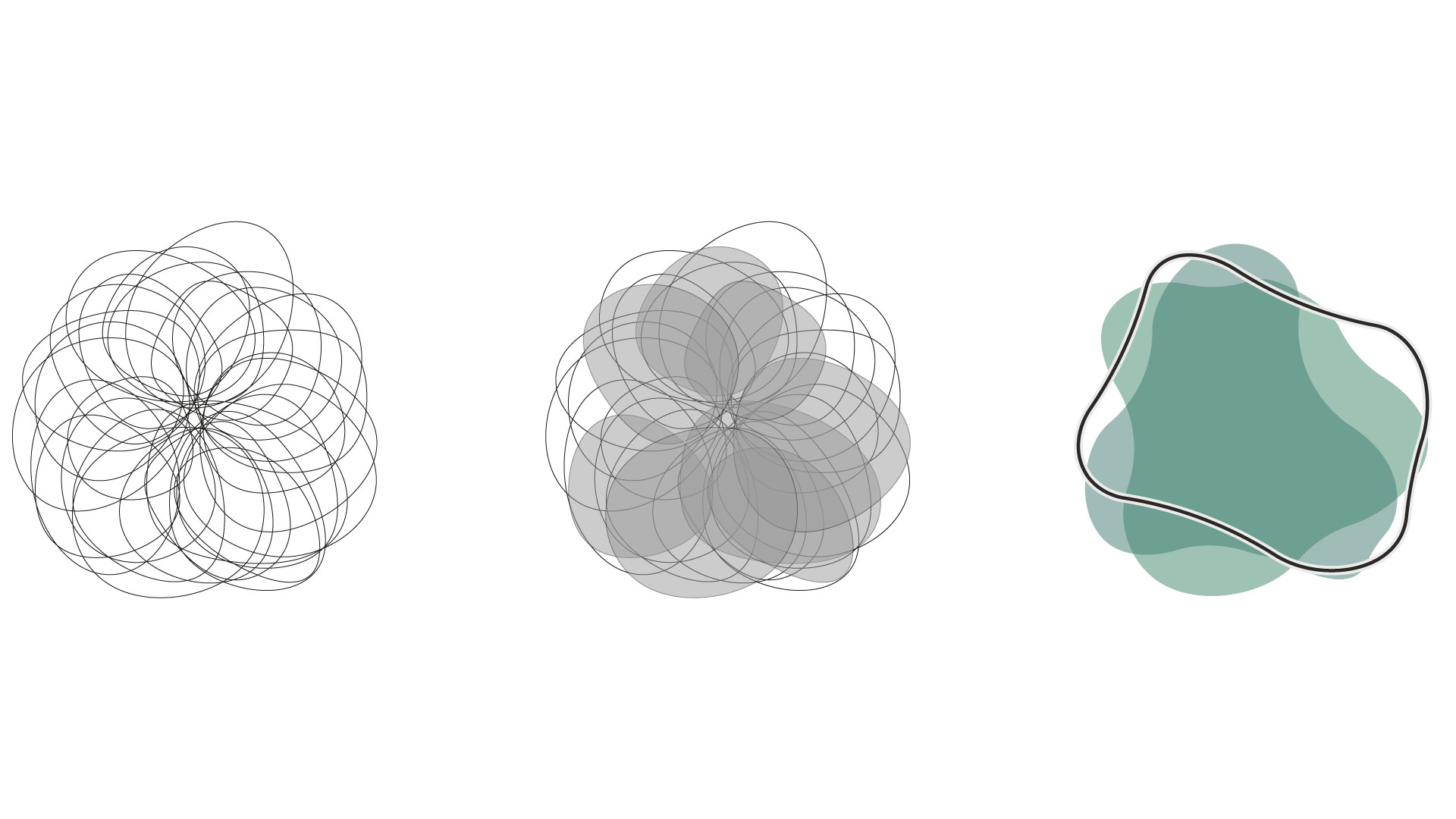
The pictogram is inspired by architectural symbols that embrace nature, maintaining elegance and visual coherence. A system of gradients inspired by topographic maps was developed to echo the concept of the Mediterranean scrub, contributing to creating a distinctive and recognizable identity language.
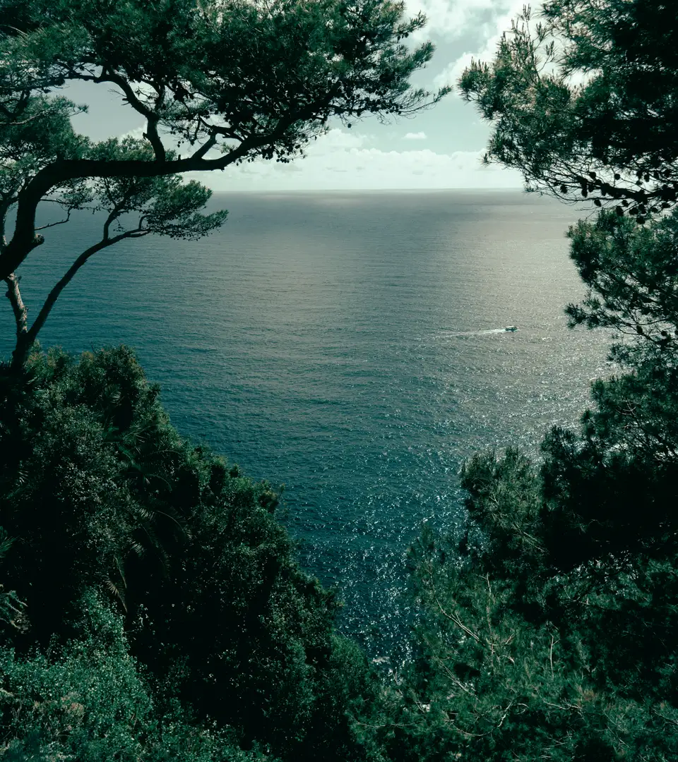
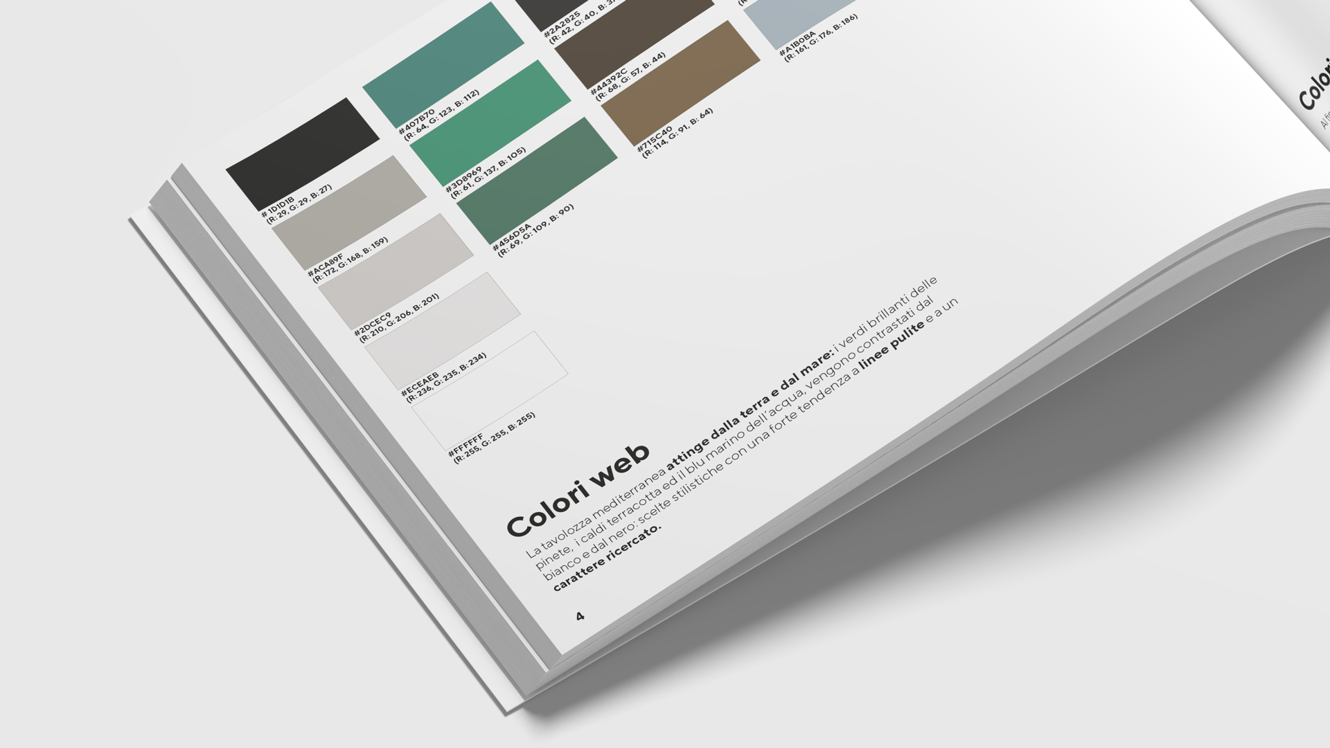
The Mediterranean color palette draws from the colors of the earth and sea, with warm tones like terracotta and ochre yellow, contrasted by fresh tones like aqua green and the bright green of pine forests, giving the brand a refined and distinctive character.
Client
Maquis A.R.T.
Year
2024
Activities
Communication, Graphics
Concept
Grucciadesign
“A unique and distinctive approach that reflected the company’s personality and mission.”

“A system of gradients inspired by topographic maps was developed to reflect the concept of the Mediterranean scrub.”