Imperial Line – communication restyling and headquarters project
Building recognizability
Imperial Line is a company with a long manufacturing tradition in the seating and furniture accessories sector. When the renewal process began, the product was solid, while the identity was less defined.
The objective was clear: to transform a manufacturer recognized within the industry into a brand with a more defined, coherent, and perceptible presence.
Subtracting to define
The strategic choice was decisive: subtraction. Removing decorative signs, reducing graphic noise, limiting the palette to black and white. Every element had to serve a function.
The new language emerged from this act of refinement: essential graphics, controlled typography, rigorous compositions. Not aesthetic minimalism, but structural clarity.
The product at the center
The photographic image also changed radically: from domestic settings to wide, industrial, almost abstract spaces. The product was no longer staged to reassure, but to be elevated.
Strong perspectives, decisive framing, a close relationship between object and architecture. Space is not a background. It is a stage that amplifies function.
A language across all tools
The new visual register was consistently applied across all tools: catalogs, website, trade fair materials, corporate communication.
The catalog became the manifesto of the new direction: dark cover, content reduced to essentials, controlled use of graphic elements.
Recognizability does not arise from an isolated element.
It arises from coherence.
Language becomes space
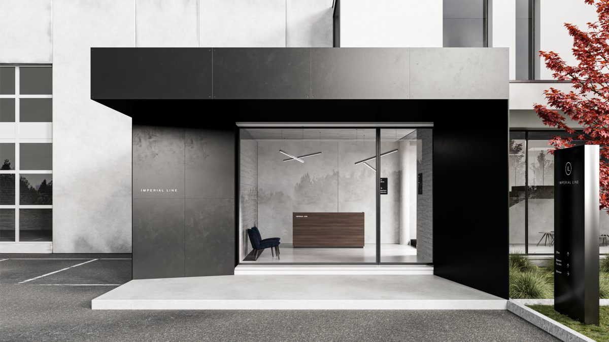
The design of the headquarters and showroom represented the natural extension of this path.
Materials such as concrete, iron, and black metal interact with the essential graphic language. Simple volumes, sharp contrasts, defined yet never invasive display spaces.
Here too, architecture serves the product, and subtraction becomes three-dimensional.
Impact on positioning
The project built a clearer and more coordinated image over time. The brand gained stronger recognizability and a higher perceived value, aligned with the company’s ambitions.
The strength of the process was not adding elements, but removing what was unnecessary.
Client
Imperial Line
Year
2020
Activities
Direzione Artistica
Concept
Grucciadesign.

“The strategic choice was decisive: subtraction. Removing decorative signs, reducing graphic noise, limiting the palette to black and white. Every element had to serve a function.”
“The strategic choice was decisive: subtraction. Removing decorative signs, reducing graphic noise, limiting the palette to black and white. Every element had to serve a function.”


“The new language emerged from this act of refinement: essential graphics, controlled typography, rigorous compositions. Not aesthetic minimalism, but structural clarity.”
“The new language emerged from this act of refinement: essential graphics, controlled typography, rigorous compositions. Not aesthetic minimalism, but structural clarity.”