Identity
When architecture becomes identity: the coordinated image for Matericostudio.
Giving a face to Matericostudio’s vision was a process in which design and architecture merged to create an identity that could best represent the style and values of the studio. Every detail was conceived to convey solidity, creativity, and professionalism, reflecting the bespoke and material approach that characterizes Matericostudio’s architectural creations.
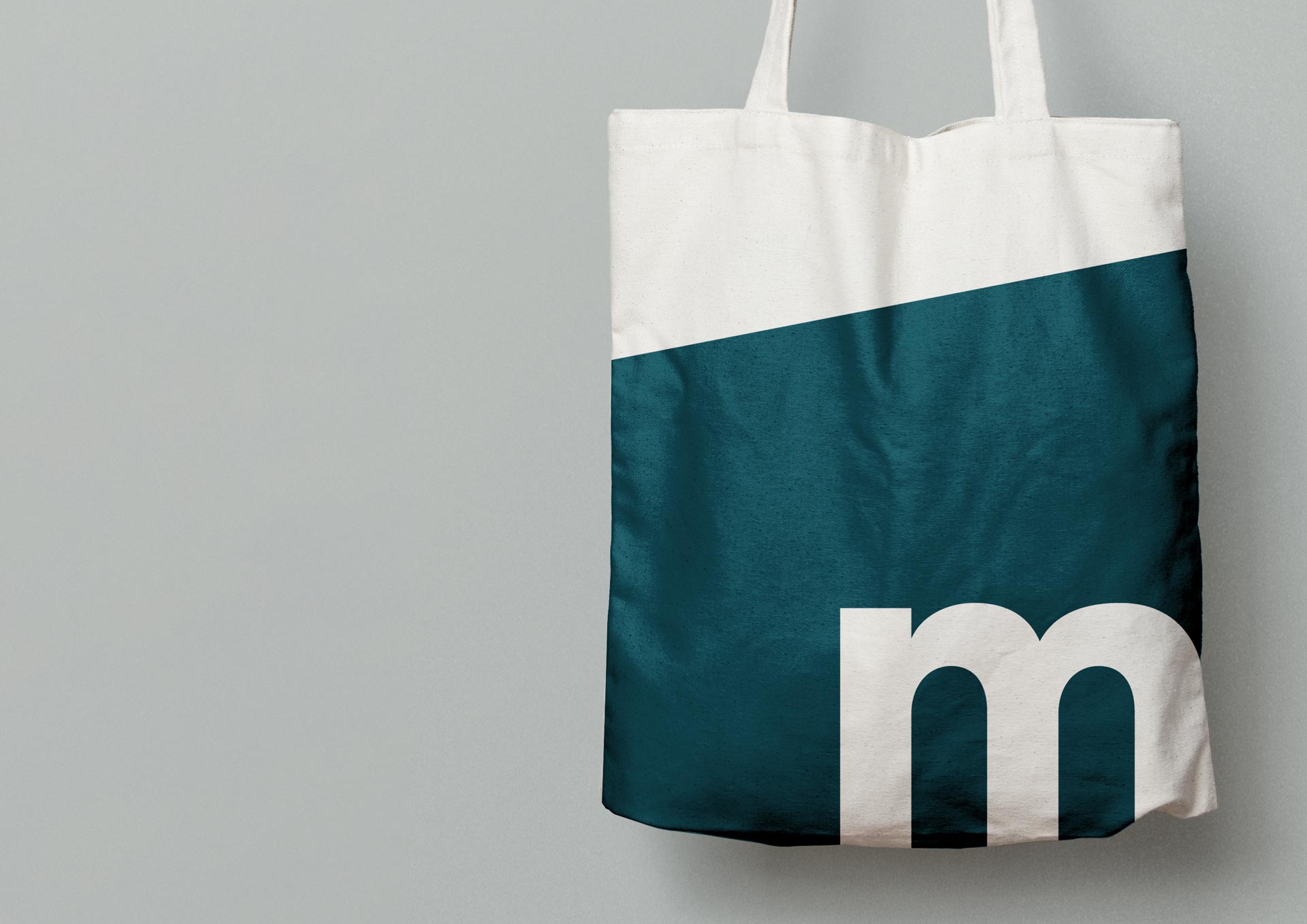
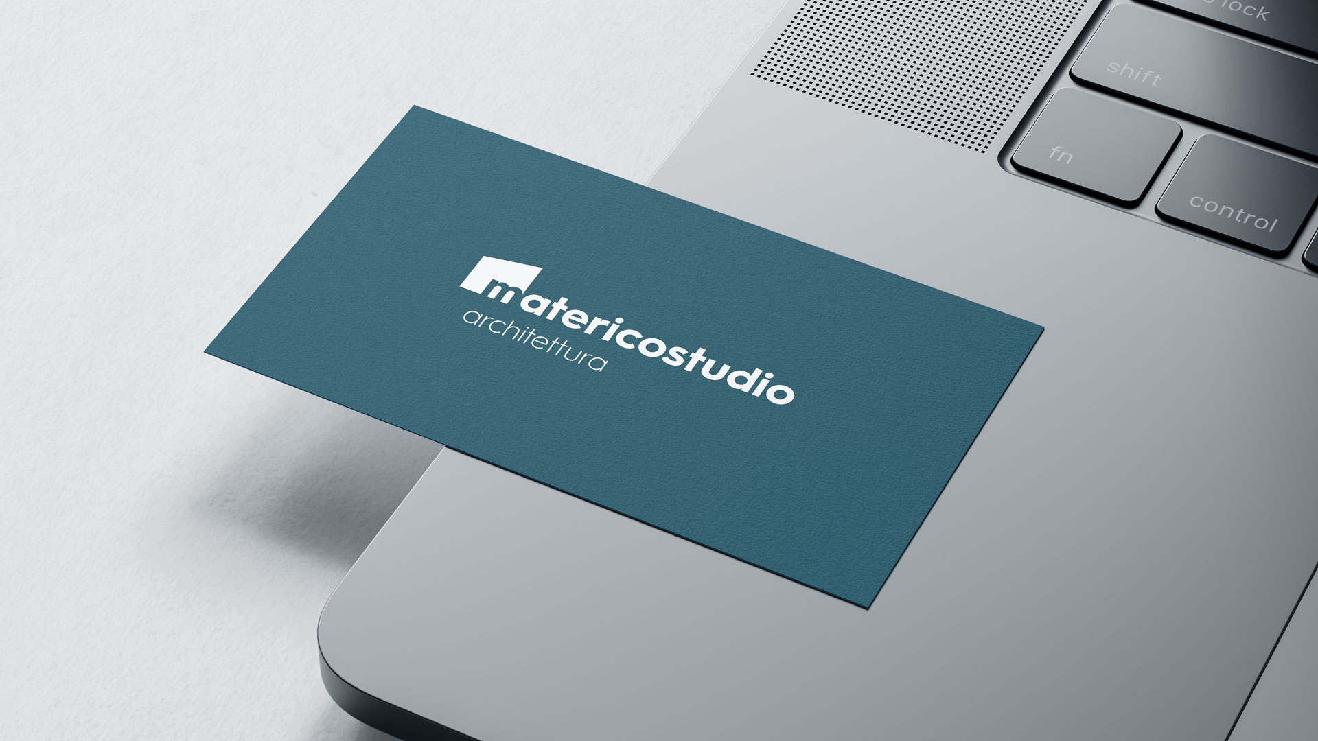
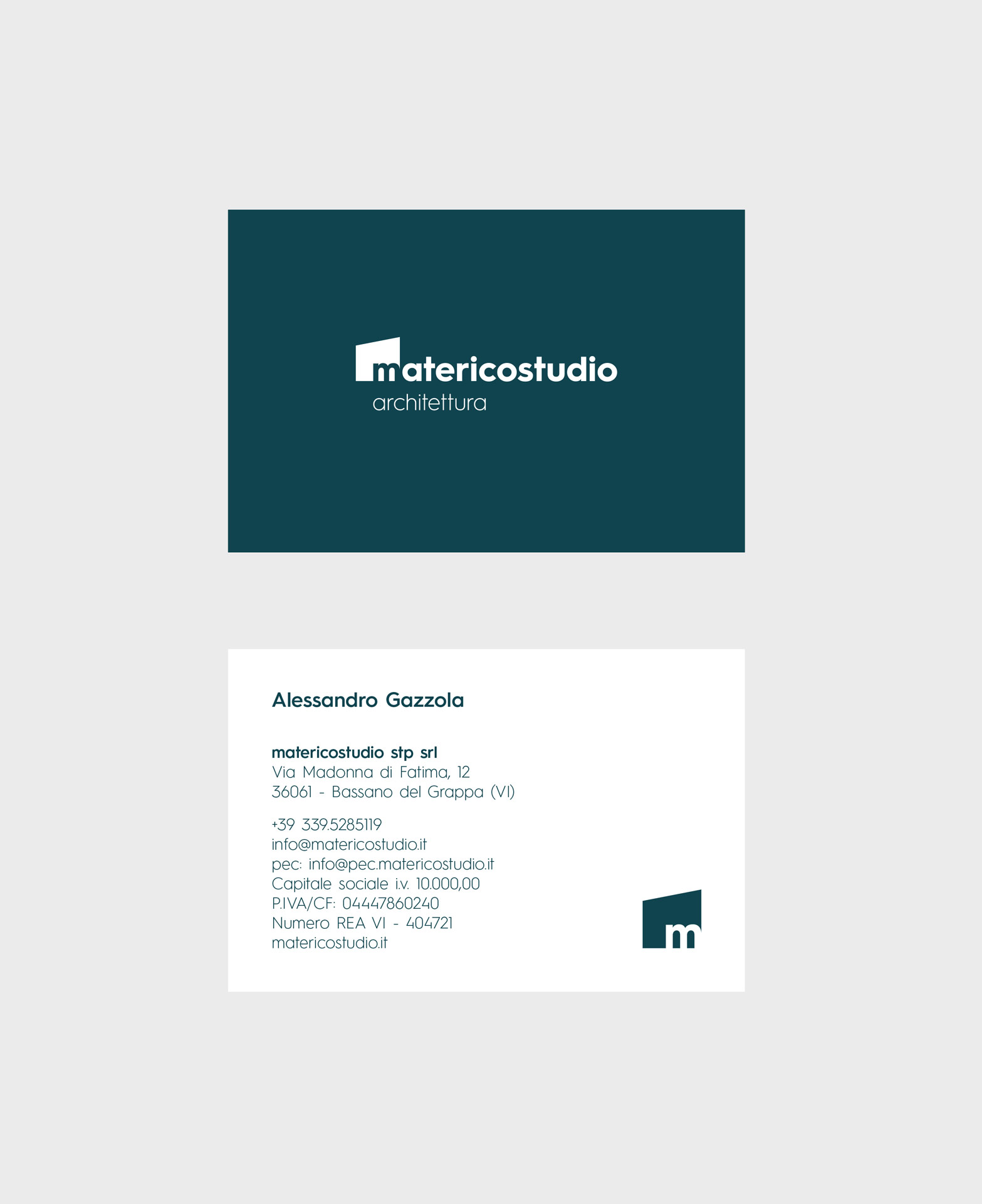
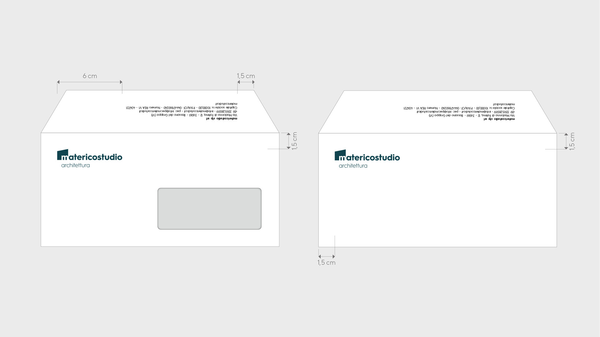
The logo, the cornerstone of this identity, was designed in an elegant petrol blue, a choice that communicates authority and contemporaneity. The logo’s form, a stylized house in the shape of a trapezoid with an integrated “M,” represents not only the first letter of the name but also the foundation of the studio’s work: creating living spaces that are as aesthetically distinctive as they are functional. The choice to include the word “architecture” beneath the logo clearly establishes the studio’s field of expertise, providing immediate brand recognition.
The color palette complements the petrol blue with neutral shades and warm gray accents, meant to evoke the natural tones of the materials the studio frequently works with. This color selection not only reflects Matericostudio’s approach but also helps create a welcoming and modern atmosphere, perfectly in line with the image it seeks to convey.
For the typography, modern, clean, and legible sans-serif fonts were selected, expressing clarity and straightforwardness. The use of essential typography emphasizes the studio’s attention to detail, creating a coherent visual communication that strengthens the core message without distraction.
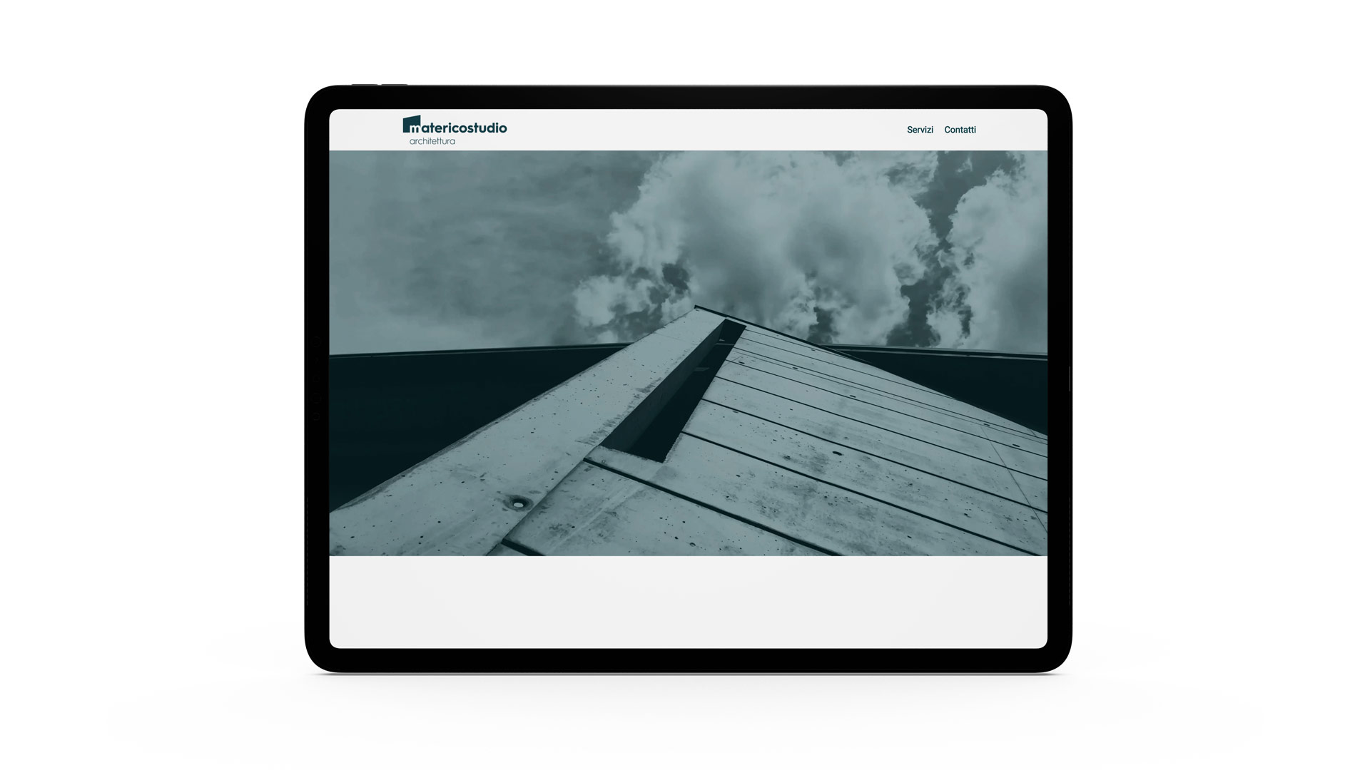
On the website, we maintained a minimalist and refined style, giving space to high-quality images of the studio’s completed projects. Each section was designed to be intuitive and easy to navigate, offering users a comprehensive overview of the services and competencies of Matericostudio. Every element was carefully thought out to ensure smooth and informative navigation, with a design that highlights the studio’s work while maintaining a simple yet impactful interface.
Finally, the coordinated graphic line extends to all presentation materials, such as business cards and letterhead. By using petrol blue as the primary color, with details that recall the geometric shapes of the logo, these tools transmit the same professionalism and attention to design that characterize the identity of Matericostudio.
Client
Matericostudio
Year
2024
Activities
Art Direction
Concept
Grucciadesign.
“The logo, a key element of this identity, was designed in an elegant petrol blue, a choice that conveys authority and modernity.”


“For the architecture and graphic layout, we followed a principle of simplification.”


“These tools convey the same professionalism and attention to design that define the identity of Matericostudio.”


