Trend Catalogue
Trend is Forma 2000 top collection: this is a company of Veneta Cucine Group. The catalogue shares the identical name as the collection; it was designed following the graphic layout of Colibrì, the first project realized for the customer.
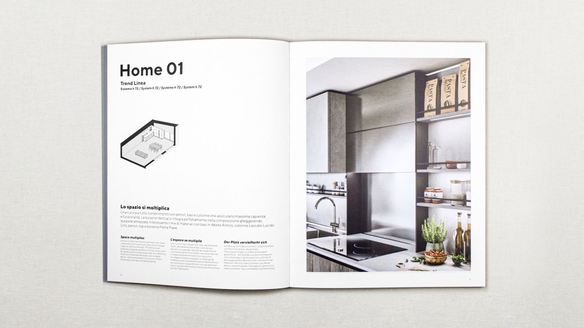
It is divided into two parts, one dedicated to handle models and the other to throat models; the two catalogues are then split internally into three sections: the first is focused on trends, a new addition to the Colibrì catalogue; the second describes the “Home”, the houses designed to set the Trend models; finally, the third contains drawings and technical information.
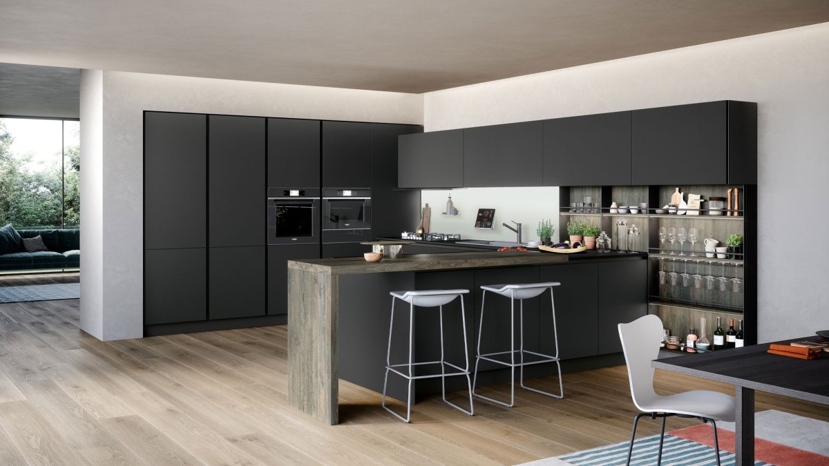
From a graphic point of view we developed ten compositions, including linear kitchens, peninsula, island, handle and throat systems. Trend presents few standard modules as it is the premium collection; for this reason the design of the compositions needs much graphic work.
Trend’s settings follow Colibrì’s graphic choices, but we designed “Home” for a higher target, with high level finishes. Same choice of Colibrì also in the use of axonometry for the technical drawings of the third section.
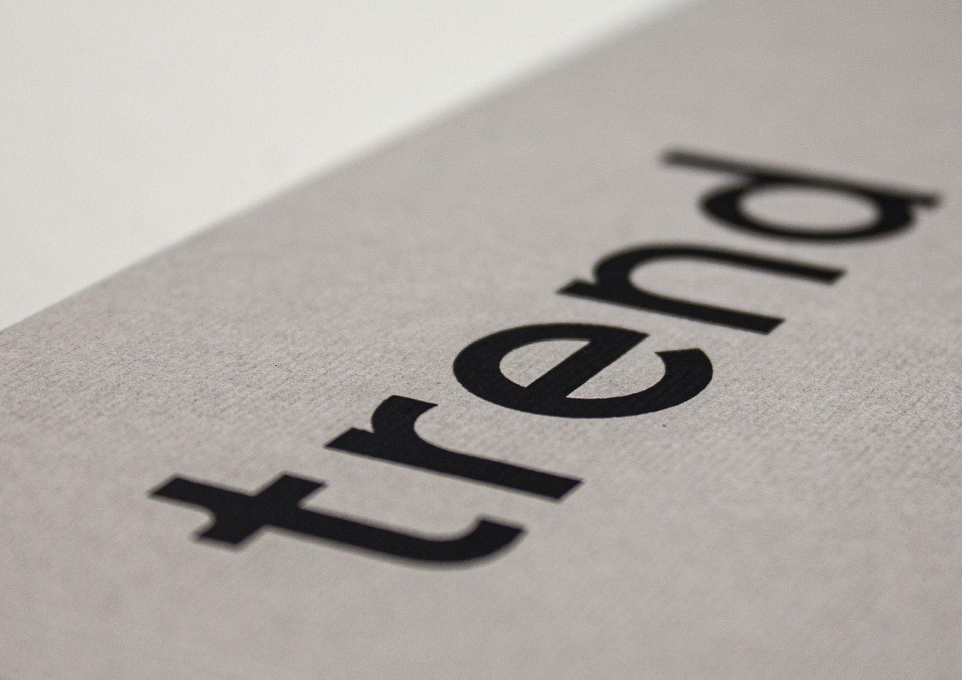
For the cover, we have selected Gmund’s Colors Felt paper, in the elegant dove grey tone; Trend’s distinctive and identity sign, the “T”, stands out on the covers of both catalogues: a simple “T” identifies the catalogue dedicated to handle systems, a “T” underlined that of throat systems.
Client
Forma 2000
Year
2020
Activities
Communication, Architecture, Design, Graphic Design
Concept
Grucciadesign.
Render
Helios Digital

“For the cover, we have selected Gmund’s Colors Felt paper, in the elegant dove grey tone”


“Trend is Forma 2000 top collection: this is a company of Veneta Cucine Group.”

“From a graphic point of view we developed ten compositions, including linear kitchens, peninsula, island, handle and throat systems.”


“Trend presents few standard modules as it is the premium collection.”


“Trend’s settings follow Colibrì’s graphic choices, but we designed “Home” for a higher target.”


“Trend’s distinctive and identity sign, the “T”, stands out on the covers of both catalogues”
